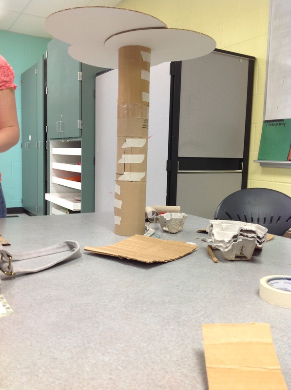
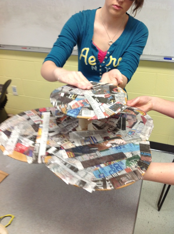
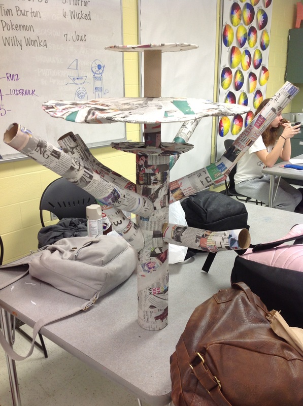
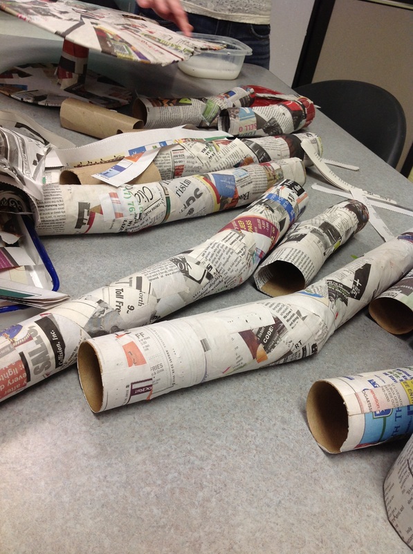
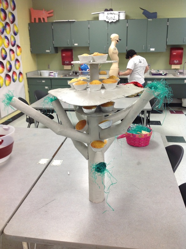
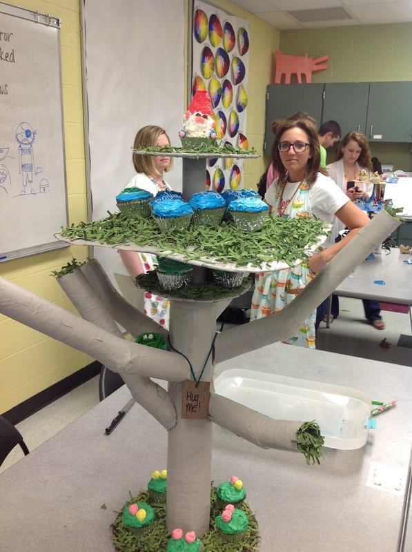
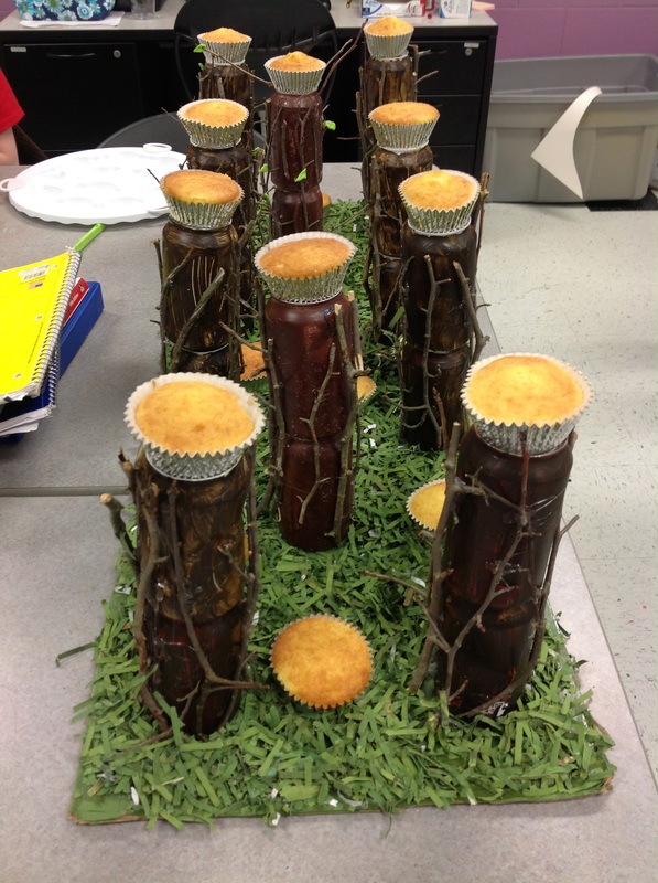
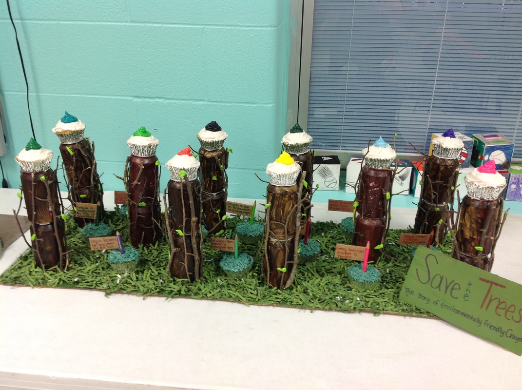
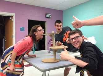
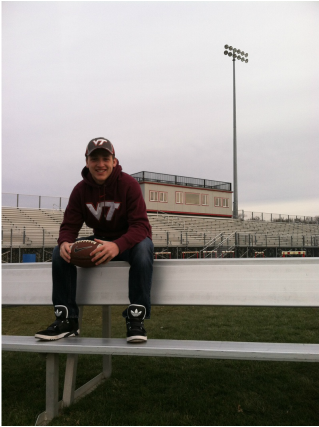
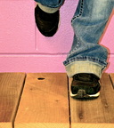
Our theme for this competition was Earth Day. We chose to do trees because it is a relevant topic applicable to our community. To go about making this sculpture we used only bi-products from trees such as newspaper, cardboard, paper towel rolls, and wood. We used paper mache to put all the materials together. We painted it with a very basic, muted, color to emphasis the color of the cupcakes. The cupcakes we used were dyed to be green and blue, and the icing was also green and blue to go along with Earth Day. Each cupcake had a different design also Earth Day related. The thing that sets our set up apart from everyone else's is that we chose to make our display so high up, and to put so much weight on the top.
Arty on!
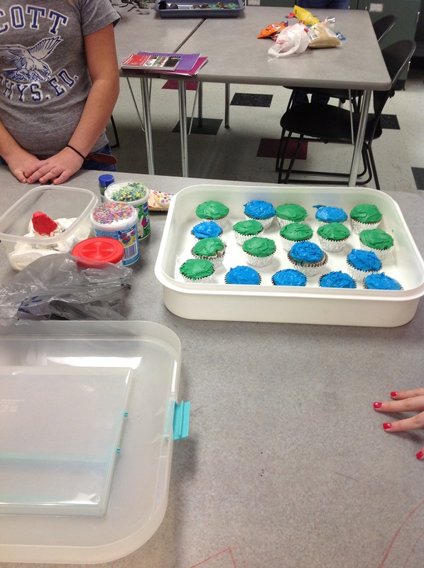
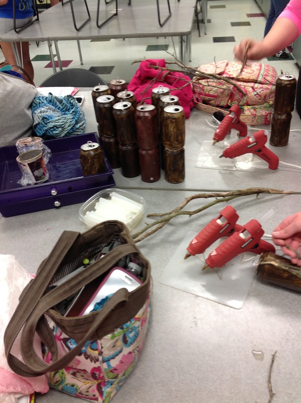
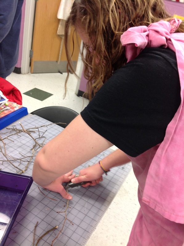
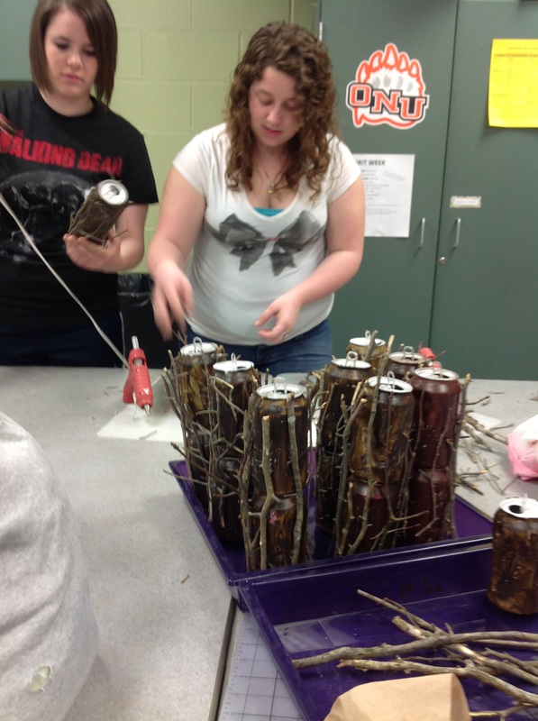
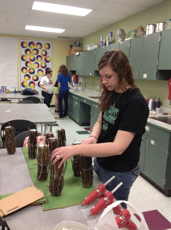
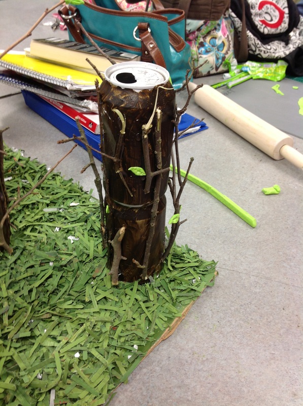
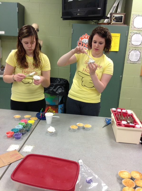
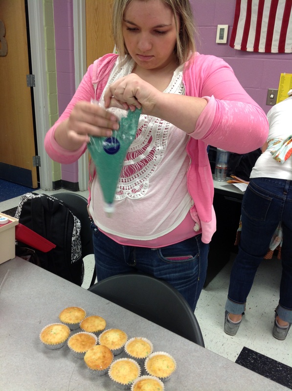
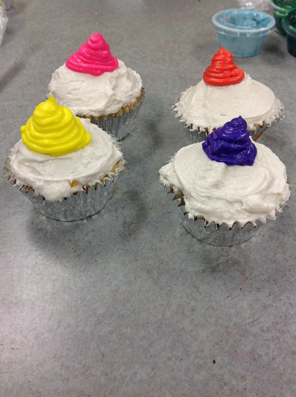
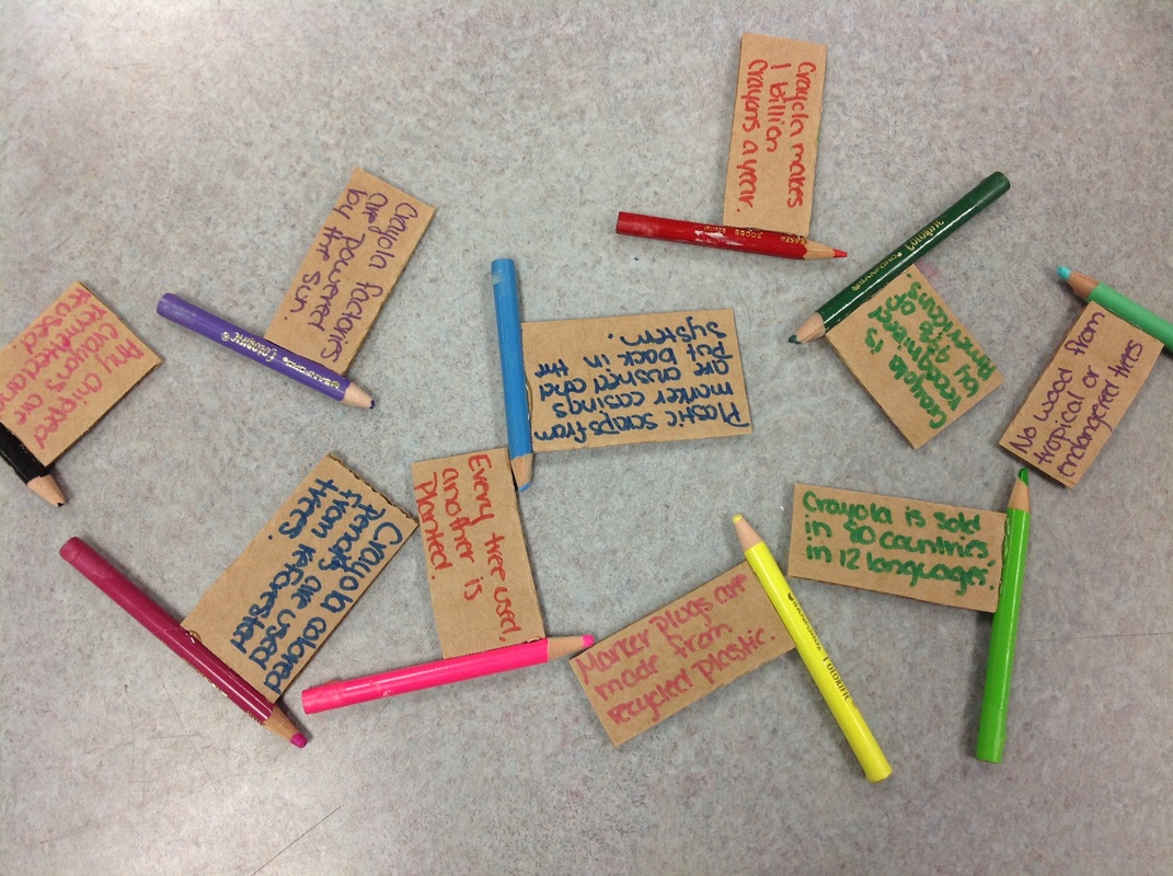
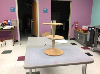
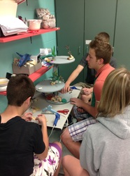
For us complete our project, there were a lot of steps we had to take. The first thing we had to do was collect cans that we painted and stacked one on top of the other. Second, we had to pick up sticks from outside. Third, we hot glued the sticks to the painted cans to make it look more as a tree. Fourth, we painted newspaper green that Erica took home and shredded and used it for grass. Fifth, we arranged the cans on top of the painted cardboard and hot glued them down. Sixth, we put plain cupcakes on top of our display to see what it would look like. Seventh, we rolled out laffy taffy and cut it into leaf like shapes that was detailed to go on the trees. Eighth, we researched facts about trees and things about Crayola. Ninth, we started icing ten cupcakes white. Tenth, we created our shrubs by using a grass icing tip. and icing ten cupcakes green. Eleventh, we wrote little facts and hot glued them onto colored pencils that were dipped in wax. We stuck the facts in the shrubs. Twelfth, we decorated the ten cupcakes tops to look like colored pencil tops. Finally, we put all of our cupcakes on our finished cupcake stand.
Arty on!
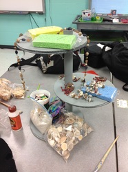
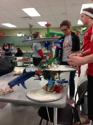
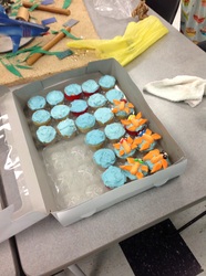
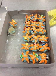
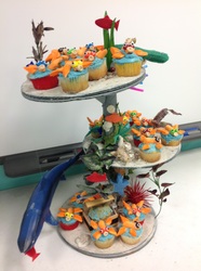
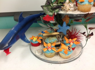
Our project that we created was based off the idea of coral reef depletion. The idea was to make people aware of the mass destruction due to human consumption and waste. As we mentioned in our presentation, there are several reason why coral reefs are slowly wasting away. Pollution, over fishing, and tourism are all leading causes. More than 80% of the worlds reefs are over fished. One-third of the world's CO2 dis fusses into the ocean which then raises the acidity. It has been estimated that in the next 30 years 60% of the worlds coral reefs will be completely depleted. While building our form we used a variety of supplies, we used a few natural resources, several recycled objects, and some miscellaneous items.
Arty on!
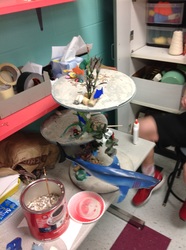
For our project we chose to do the BP oil spill. This was the largest oil spill in American history. To portray this we chose to make our project out of three records and three plastic wine glasses. All of our materials were recycled. We glued it together and made three tiers. We painted the tiers blue.The top was light blue and we shaded each level under it. We put hot glue on the wine glasses and we painted it black to make it appear like oil. On the top tier we added a beach by making half the record sandy. On the very bottom we glued cut up water bottles that were painted black. This helped portray the theme of oil dripping down. When we added our cupcakes, the project became unified. The cupcakes were different shades of blue depending on the layer it was on. The top layer cupcakes had brown sugar and black icing on them. This was supposed to portray sand. The rest of the layers just had gummy sea animals with oil. Everything was edible.
Arty on!
Students in 5th bell worked with Ms. Foster's drama students to create powerful images focusing on bullying in school. The collaboration was wonderful! There were underclassman and upperclassman working together and creating exciting and new connections.
I was very impressed that in just four days, students found strong concepts, created powerful images and were able to present to their peers. I was moved by many of the projects and the ability for students to confront such large and sometimes uncomfortable images.
Arty on!
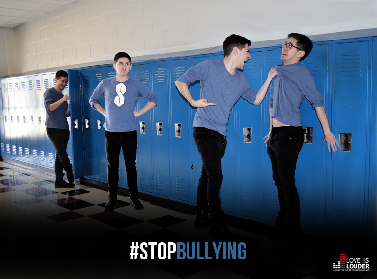
bullying roles:
A student worked by himself to create this powerful image. He represented the common roles played by students including: bystander laughing at their locker, someone to stand up and stop bullying, a bully and a victim of bullying.
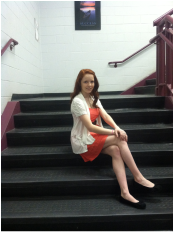
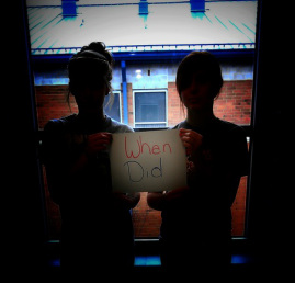
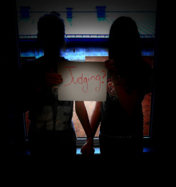
emotional bullying:
For these photographs we used balancing elements. On each side of the picture there is a girl holding the sign. If you cut this picture down the middle it would be balanced. We also used framing. The girls are framed behind the window to help focus more on them. We also cropped the picture to get the effects we wanted.
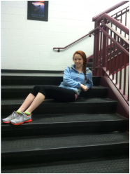
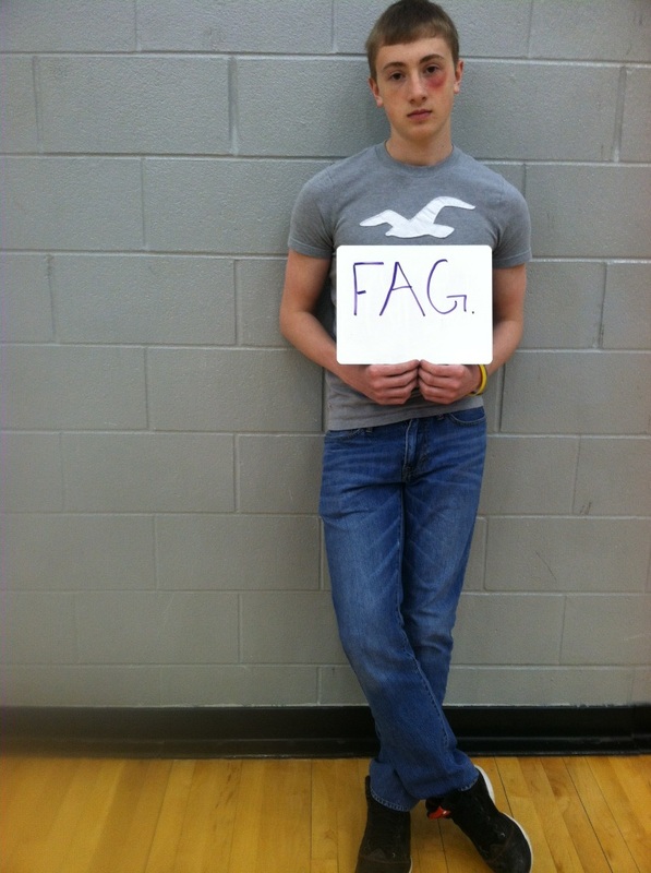
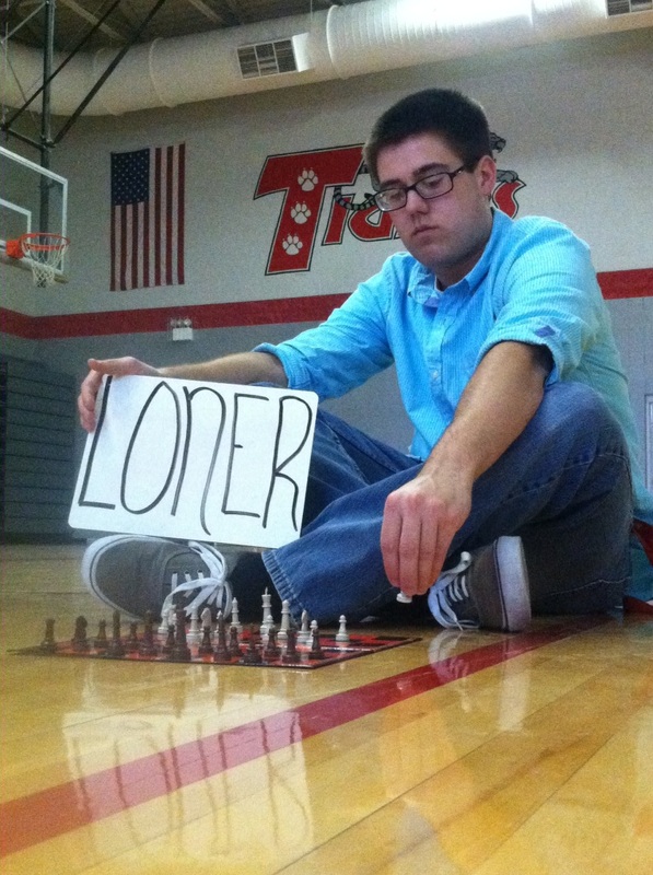
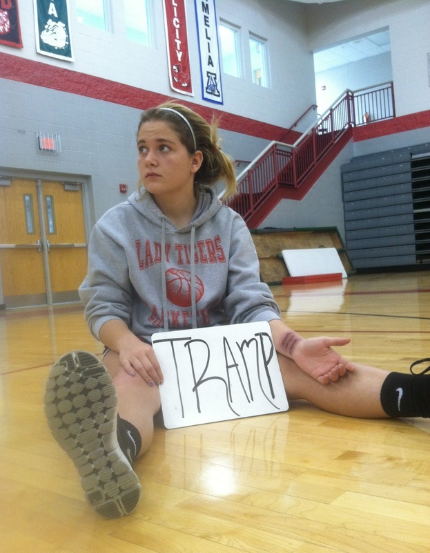
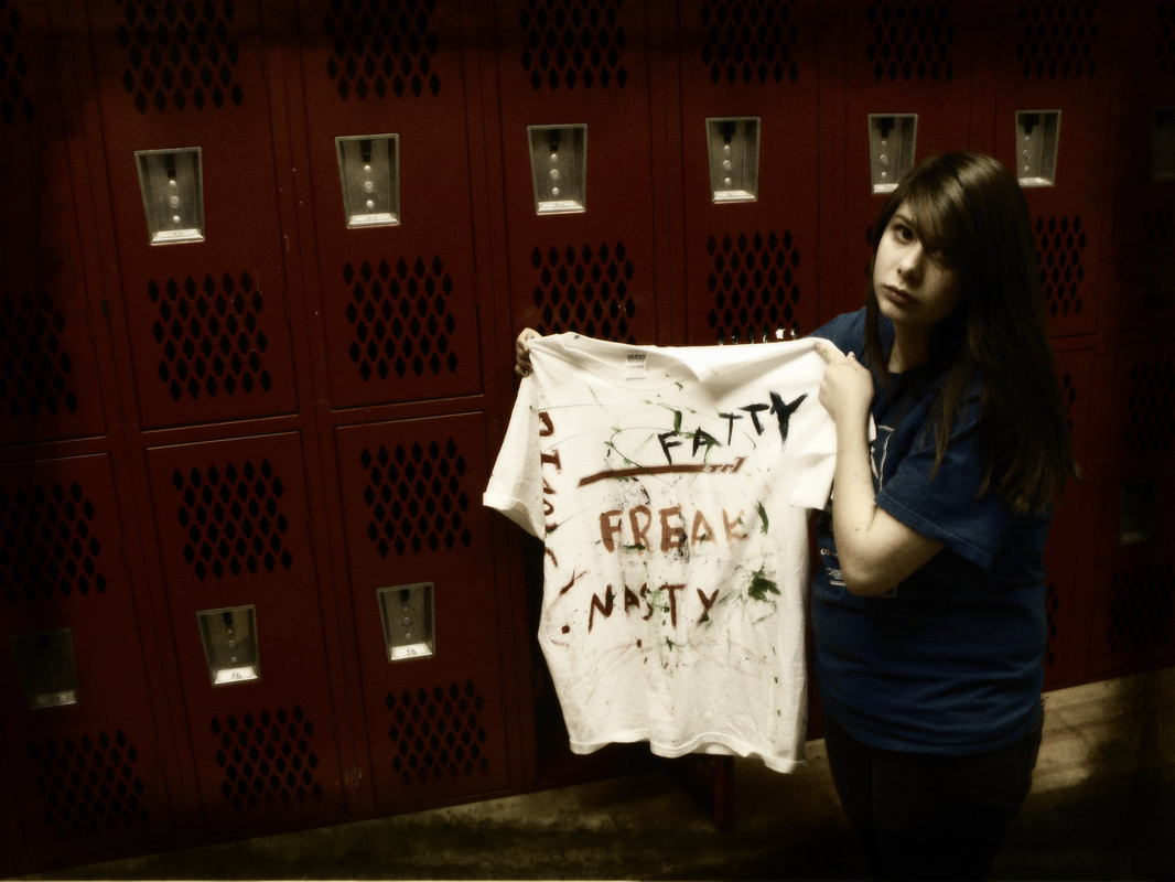
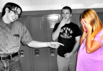
verbal bullying:
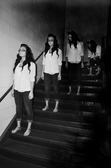
For these photographs we used rule of thirds (fag image), perspective and leading lines (loner image) and odd numbers and use of space (tramp image).
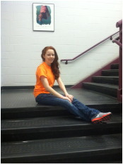
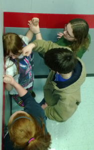
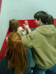
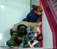
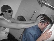
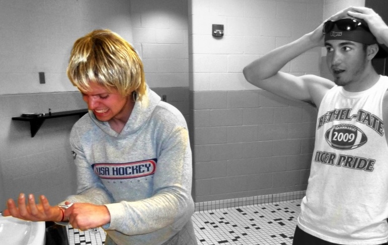
physical bullying:
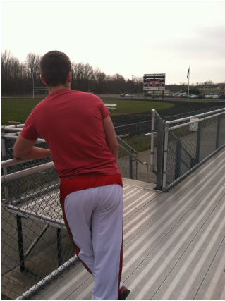
For these photographs we used perspective and birds eye view.
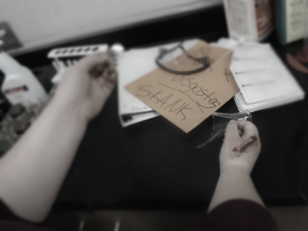
vandalizing bullying:
For these photographs we used:Color: We used color to make things stand out and to bring attention to the main focus of the pictures.
Rule of Thirds: We used rule of thirds to build up tension in some of the pictures. It also provides interest to the pictures.
Perspective: We took some of the pictures from the victims point of view. This gives it more meaning and gives you a sense as to how the person is feeling.
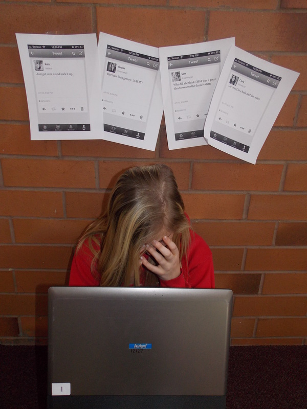
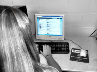
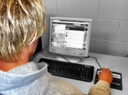
cyber bullying:
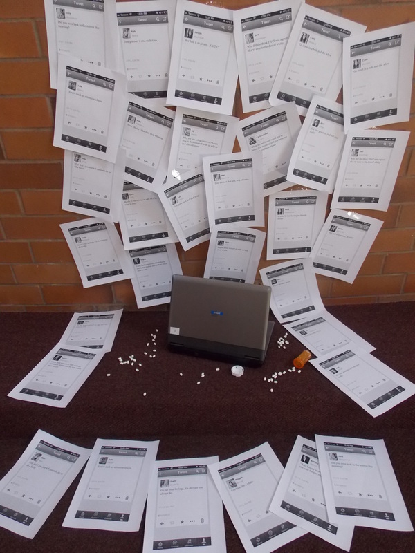
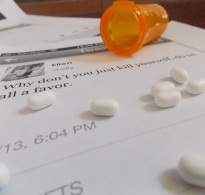
For these photographs we used perspective, leading lines, use of space and dominant emphasis.
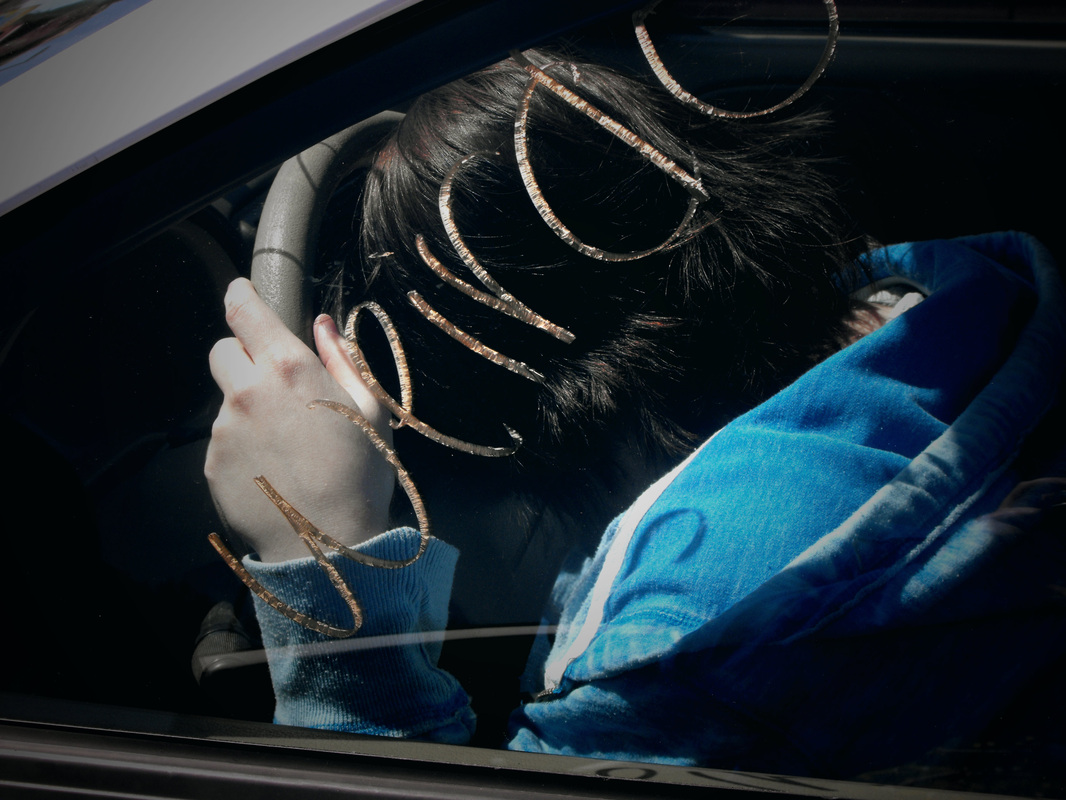
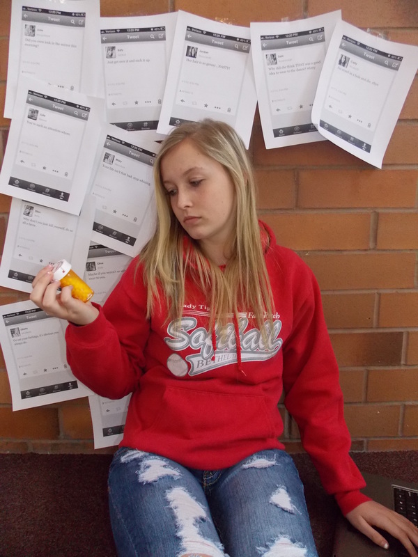
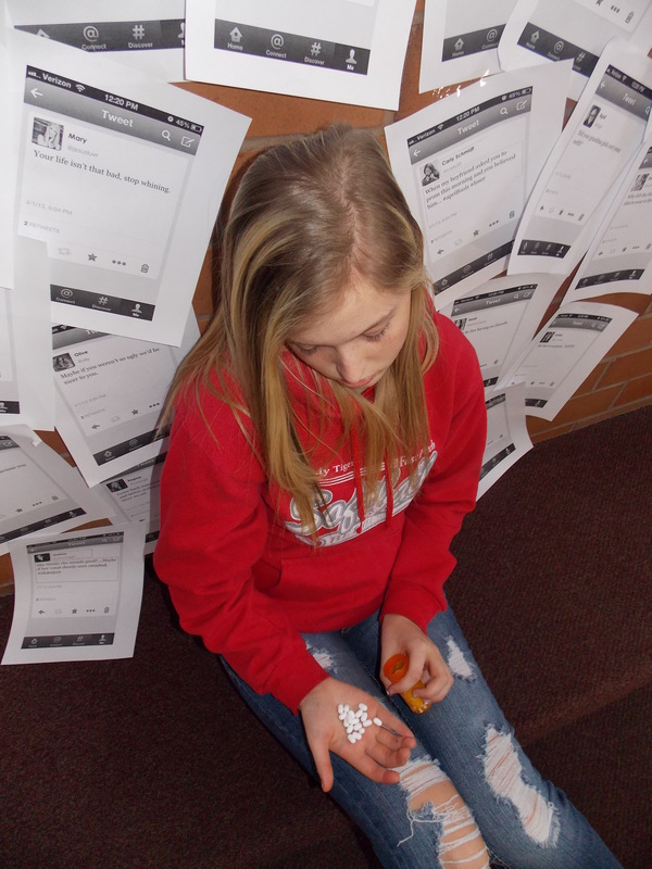
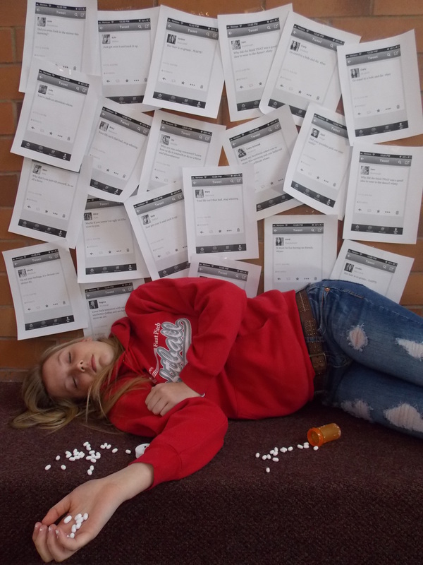
the bully cycle:
We portrayed physical, verbal, cyber and self harm. For these photographs we used leading lines, odd numbers, use of space and balancing elements.
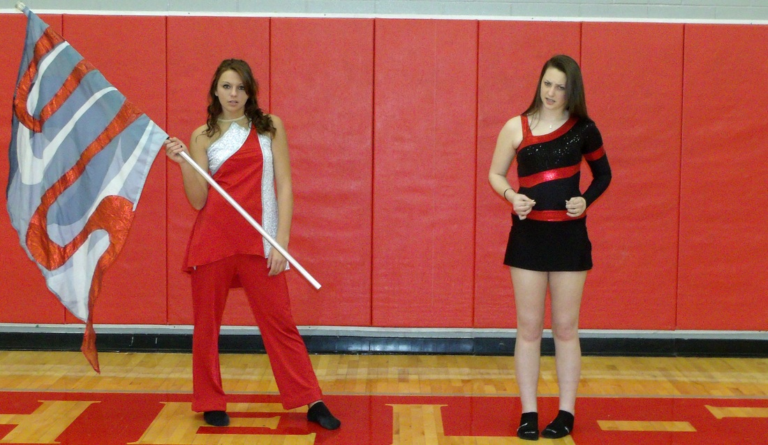
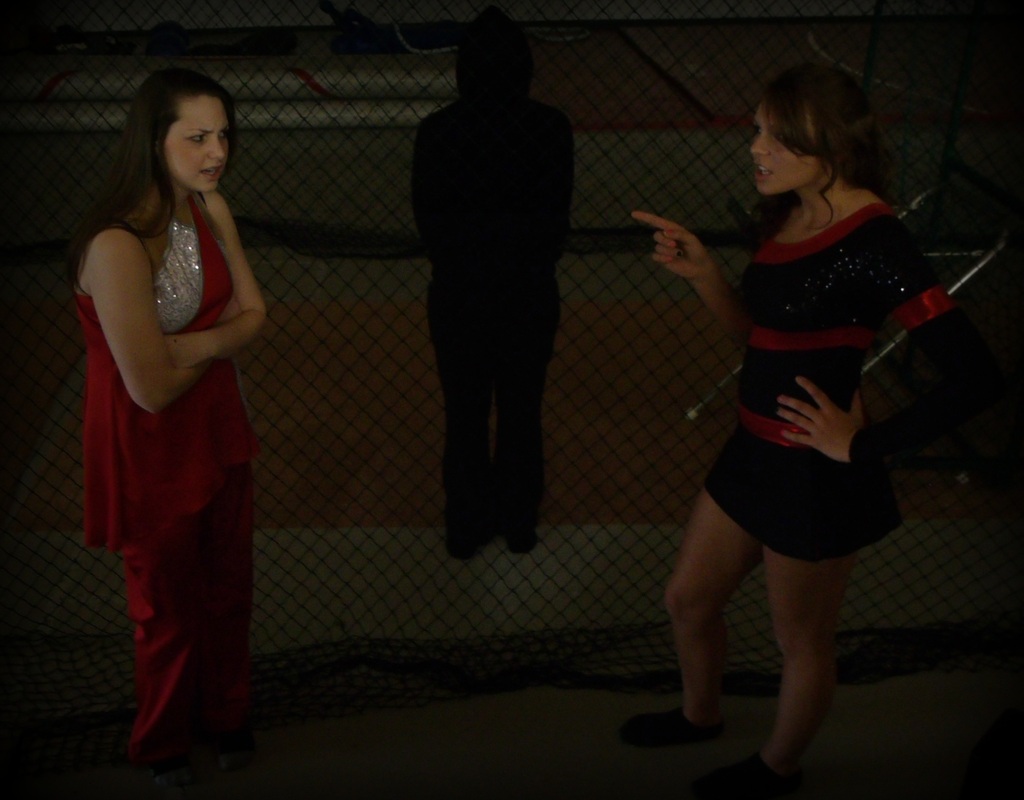
misguided bullying:
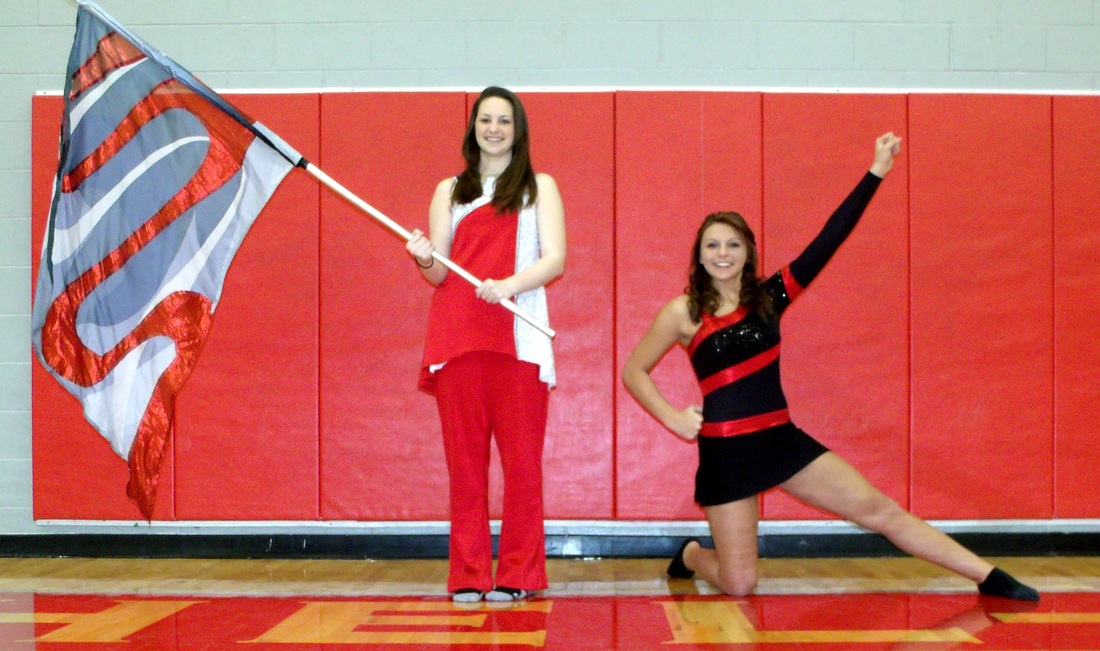
Our project represents the newly occurring debate on whether or not the dance team should become a part of the color guard and band to spare time at half time of football and basketball games. We have friends who have bullied and been bullied on this subject so we have a pretty good insight on the matter. We used somewhat of a birds eye view perspective to represent that higher power unlike the other two pictures.
| Our first picture represents one member from both the color guard and the dance team, happily where they feel they belong.
| Our second picture shows what we feel would happen if they were to switch places, therefor we had the girls switch uniforms and show a sense of unhappiness.
| Our third picture shows the girls arguing with a black figure behind them. The picture represents misguided bullying, the black figure is a "higher power" that has control over what the girls are arguing about.
|


 RSS Feed